Typography plays a crucial role in design and marketing. It can help to communicate your brand’s message and personality, and it can also help to grab the attention of your target audience on the shelves. In this blog, we’ll discuss how to use typography effectively to capture your customers’ attention.
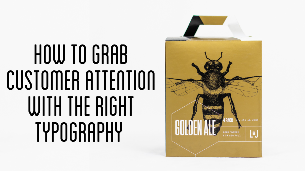
First and foremost, choosing the right typefaces for your brand is essential. Does your brand scream serif font, sans-serif font, or a decorative font? Appropriate fonts depend on the tone and aesthetic you want to convey. Serif fonts are more traditional and formal, while sans-serif fonts are more modern and clean. Decorative fonts can add personality, but it’s important to use them sparingly — they can be hard to read at small sizes. In the craft beer industry, you want fonts that are easy to read to convey your messaging when customers pass your packaging quickly.

Once you’ve chosen a typeface, you’ll want to consider font size and weight. When choosing a font size for your craft beer packaging, there’s a lot to consider. A large font size can help grab attention, but it’s essential to use it in moderation. Large fonts can be overwhelming. However, using a small font size can make your packaging text challenging to read and could cause your audience to lose interest or choose to avoid reading your message. Try using bold and italicized text to stand out more than regular text on your craft beer packaging.
Another important aspect of typography is hierarchy. This refers to the arrangement of text on the page, with the most important information being the largest and most prominent. Using different font sizes and weights can help establish a hierarchy and guide the reader to the most important information — how excellent your craft beer is!
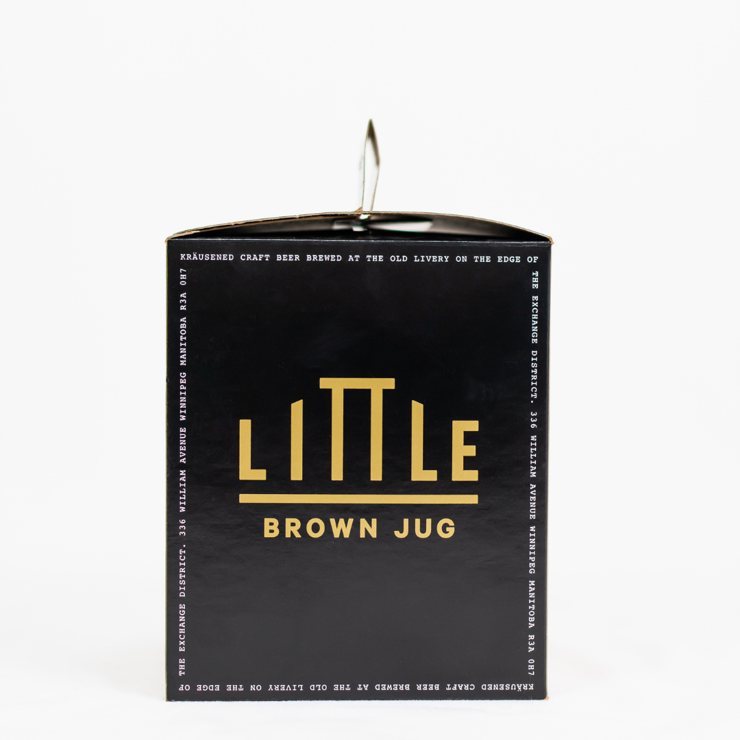
White space, also known as negative space, is another consideration when choosing typography for your craft beer packaging. This is the empty space surrounding your text. White space can help to make your text more legible and visually appealing. Too much text with little white space can look cramped and overwhelming.
Don’t forget about alignment! Aligning your text to the left, right, or centre can change the feel and readability of your text. Left-aligned text is the most common and easy to read, while right-aligned text can add a formal touch. Centre-aligned text can be more eye-catching, but it can also be more difficult to read if there is a lot of text.
Finally, consider pairing your text with appropriate images and graphics. These can help grab your audience’s attention and add visual interest to your branded packaging. Just be sure to choose relevant and high-quality images, and be mindful of how they align with your text.
In conclusion, typography is a powerful tool in design and marketing. By choosing the right typeface, font size and weight, establishing hierarchy, using white space effectively, aligning your text appropriately, and pairing it with relevant images, you can grab your customers’ attention and effectively communicate your brand’s message.
Crafted Box Co. makes carton packaging customized to your brand. Take up more shelf space and increase your share of the market with unique and exciting packaging.
Contact us here for a free quote.