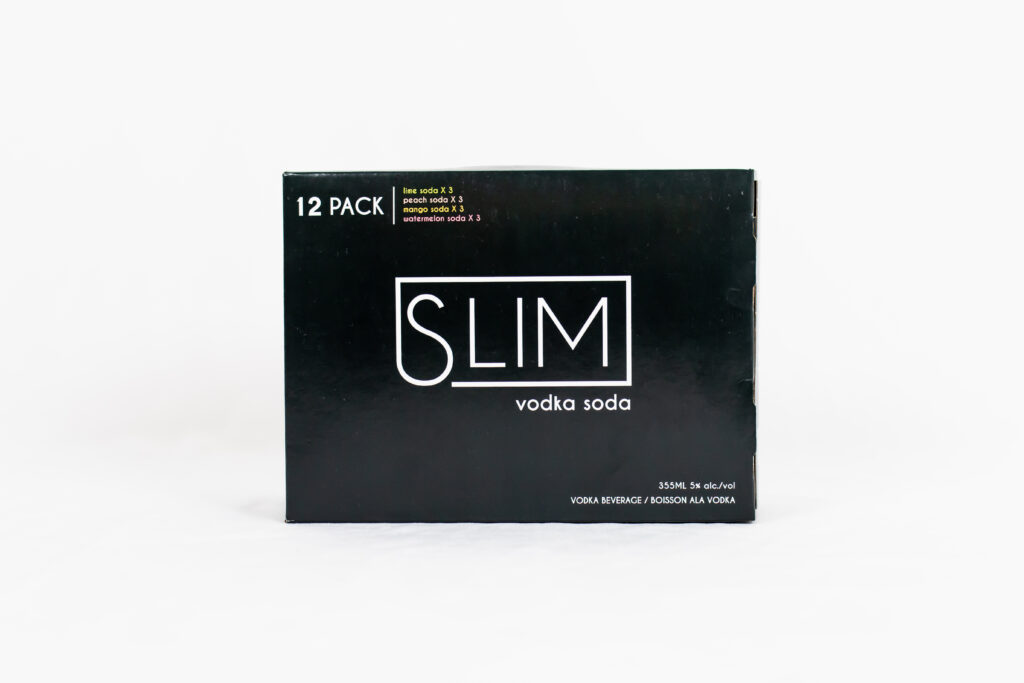
The craft beer box design space is packed with bright colours, loud fonts, and many options. In a time of information overload, we’re increasingly seeing brands turn to minimalist packaging designs.
It’s important for brands to understand how the principles of the minimalist movement intersect with the best practices in the industry. There are a ton of added benefits in using a minimalist design. Here’s how you can “do more with less” in your craft beer packaging designs.
What is Minimalist Packaging?
The minimalist movement is about reducing the excess.
Minimalism in the packaging industry is about removing all unnecessary components. It has clear and concise messaging, stands out beside products with flashy visuals and communicates your brand values.
Minimalism does not mean less work. Doing too little can portray cold and uncaring feelings, so it’s important for your graphic designers to find the middle ground between simple and complicated.
The functional goals of minimalism are:
- Let materials stand alone
- Focus on a single (or minimal) stand-out elements
- Accents shouldn’t overpower
- Use restraint
What are the Benefits of Minimalist Packaging?
People like minimalist designs because it offers a break from the constant noise we encounter each day. On packed shelves with complex designs, minimalism might be the best way to catch your customer’s eye.
Great minimalist designs in craft beer packaging will quickly and clearly convey your brand message. People spend less time skimming distracting designs and focus on the unembellished message right in front of them.
Consumers want transparency from brands. Straightforward communication on your packaging makes it easy for purchasers to make decisions they feel good about when choosing your craft beer.
What are the Best Practices?
Remain Consistent
Brands typically use similar concepts across their brew branding, making it easy for consumers to recognize their craft beer. The goal is to embrace efficiency and make it easy for customers to identify your products.
Be Bold
When you cut out the noise, it allows for room to get creative. Try making bold statements that will catch your customers’ attention — and could be an effective sales tactic!
Highlight the Value
Highlight a single feature for maximum effect. What’s your Unique Selling Point? Being aware of your customer demographics is a great way to understand why your customers buy what they do. Then, make this the focus of your craft beer package design.
Give Information With Colours
Colours can communicate feelings and flavours. If you are considering trying a minimalist design, try using colurs to match flavours and eliminate excessive text.
Leverage White Space
Minimalistic designs use a lot of white space on craft beer packaging. Try compressing designs into small areas of the package, which will draw the purchasers attention towards that design.
Using the right packaging allows you a chance to connect with your customers and potentially build a loyal customer base. Using eye-catching packaging with clear copywriting can create a positive, memorable and enjoyable experience for your customers.
If you’re ready to get make your products stand out from the rest, then contact us here.
